Esplanade Website Redesign


Concept · UI/UX Design
Duration
2 Weeks
Role
UX Designer/ Prototyper
Tools
Axure PR, Treejack, Sketch, Post-it
Overview
Working alongside with 2 teammates, Rina (Product Manager) and Han Loong (User Researcher), our main task was to redesign the Information Architecture (IA) and key pages layout/wireframes of Esplanade. We proceeded with the project by following the design thinking process.
Esplanade is a not-for-profit arts centre, socially motivated by the mission to entertain, engage, educate, and inspire communities through the arts. Other than performing venues, the Esplanade also contains retail and meeting venues, as well as other lifestyle and arts-related services, which contribute a significant percentage to their total annual revenue (40%). ”

The Process

the summary of the design process

User Research

What are the contents the website contains?

We started the project by conducting a inventory to get an overview of the existing content on the website.

User research & Interviews

Derived from the annual business report for Esplanade and the content inventory, we came up with 4 in scenarios and tasks. We conducted interviews and usability testing on the original website to see how users navigate to find the tasks and scenarios given. We wanted to understand the reasons and objectives of people who use the site? And we also wanted to evaluate the heuristics of the website before coming up with a problem statement and hypothesize.

Audience Groups
On synthesizing our user research, we could define 2 groups of audiences.
Casual Arts-goers
“I like to make the most of my weekends by checking out interesting events. I also like trying out cool bars and restaurants. ”
Avid Aficionados
“As part of a performance group, it is important for us to be able to quickly find information on venues so that we can book and plan our performances easily.”
screenshot of some of the analysis docs

Issue Prioritisation

1

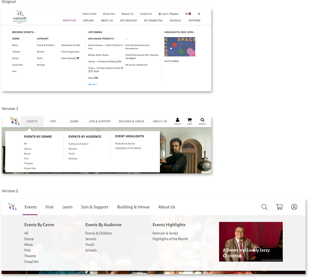
Confusing Double Navigation Bar & Too Many Menu Items
  • 5/6 users had difficulty finding the ‘Visitor Guide’
  • 3/6 users had trouble locating the ‘Eat & Drink’ menu item 3/6 users were unsure about the difference between ‘What’s On’ and ‘Explore’

2

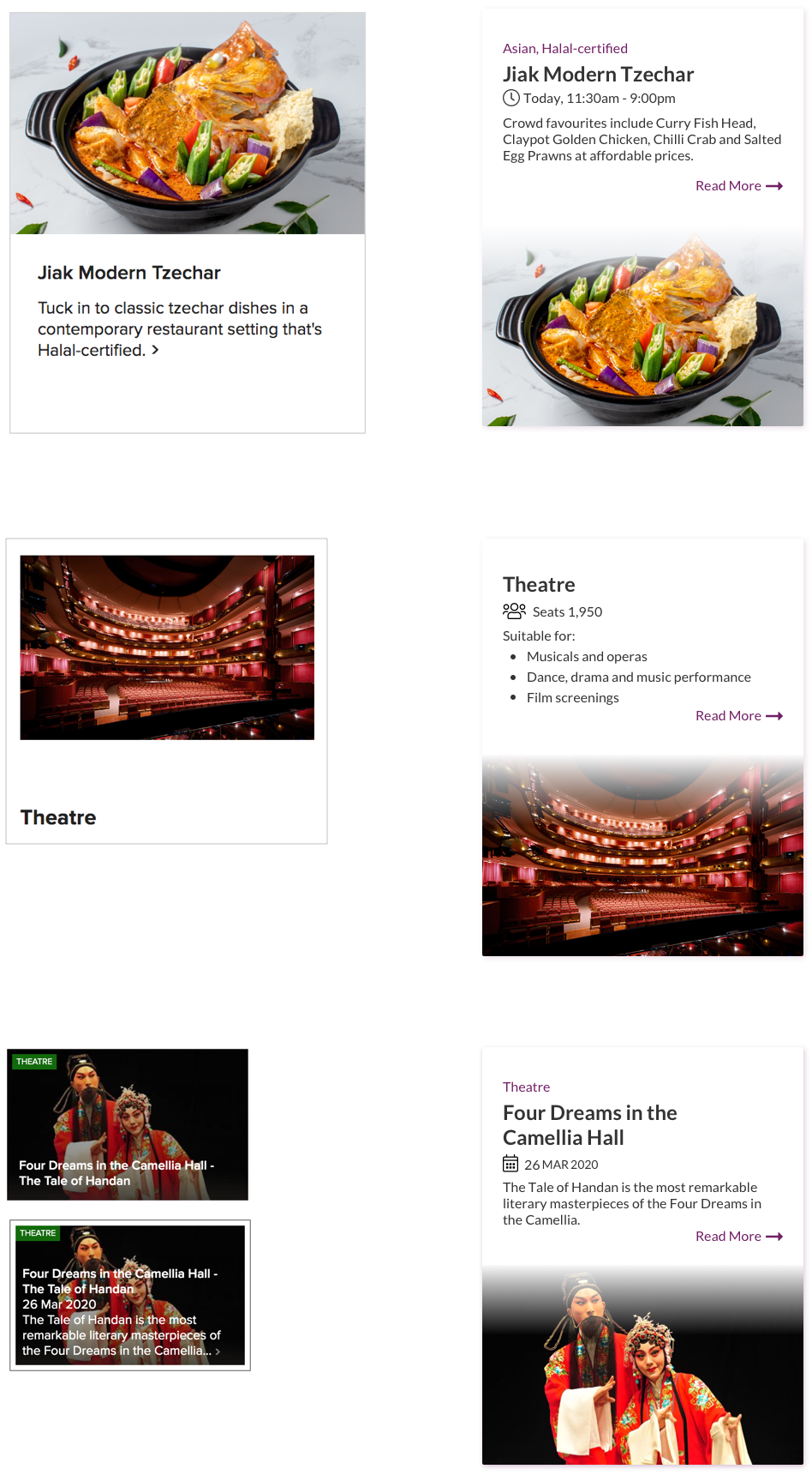
Cluttered and Insufficient Information
  • 3/6 users were uncertain about the type of food the restaurant serves
  • 4/6 users were frustrated at having to click on each venue page to access necessary venue information such as seating capacity

3

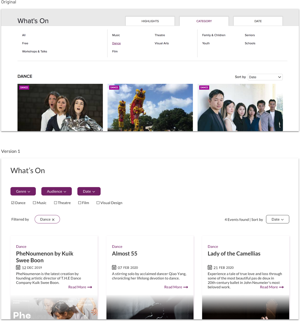
Inflexible Filters and Too Many Results
  • 6/6 users manually scrolled through multiple pages to find an appropriate event

Revised Information Architecture
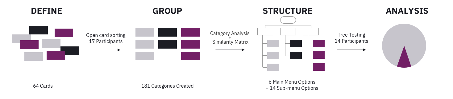
To address the issue with the navigation, we needed to revise the information architecture of the site.
Card sorting

We used an open card sorting methodology to understand better how users group concepts and label the groups.

Tree Testing

We redesigned the grouping and relabeled some of the concepts based on the response from card sorting. And we conducted a tree testing section to test our revised architecture.

88%

ends up at the correct answer

79%

answers are chosen without backtracking
screenshot of some of the analysis docs

Prototype + Result

We set up a hi-fi clickable prototype using Axure PR to provide usability insights.
New Navigation Bar & Mega Menu
Derived from tree testing results, we reduced the number to categories in the global navigation and relabeled the categories with more intuitive labels.

With the new single-line design, the behavior of the navigation bar is more consistent too. On the original website, users can hover the categories in the second row to trigger the mega menu. But, categories in the first row are not hoverable. And user can only click them to open the corresponding page.

During the usability testing on version 1, 2/5 testers accidentally dismissed the mega menu due to the gap between the mega menu and navigation bar. Thus, in version 2, we removed the gap to provide a smoother experience.
New Card Template
From the usability testing on the original website, the testers either couldn't find the information buried in the paragraphs of text, or they had to click the card one by one and read some basic information in the detail view.

The new card design makes essential information right in front of users. It uses bullet points, and typographic hierarchy to make the information more scannable.

Lastly, we also introduced a visual cue to show the card is clickable.
New Filters
Finding events is the most important feature people use the Esplanade website. However, the current filter design doesn't allow users to apply multiple filters. It works more like two-level navigation.

The first issue our new filter design addressed is to support applying multiple filters.

Additionally, from the usability testing on the original website, we also noticed that people liked to scroll down and had an overview of the number of results. Thus, we also introduced the result count so that users can adjust the filters to get and a decent amount of results.

Adaptive Design

We also redesigned the mobile website based on our new desktop site design.
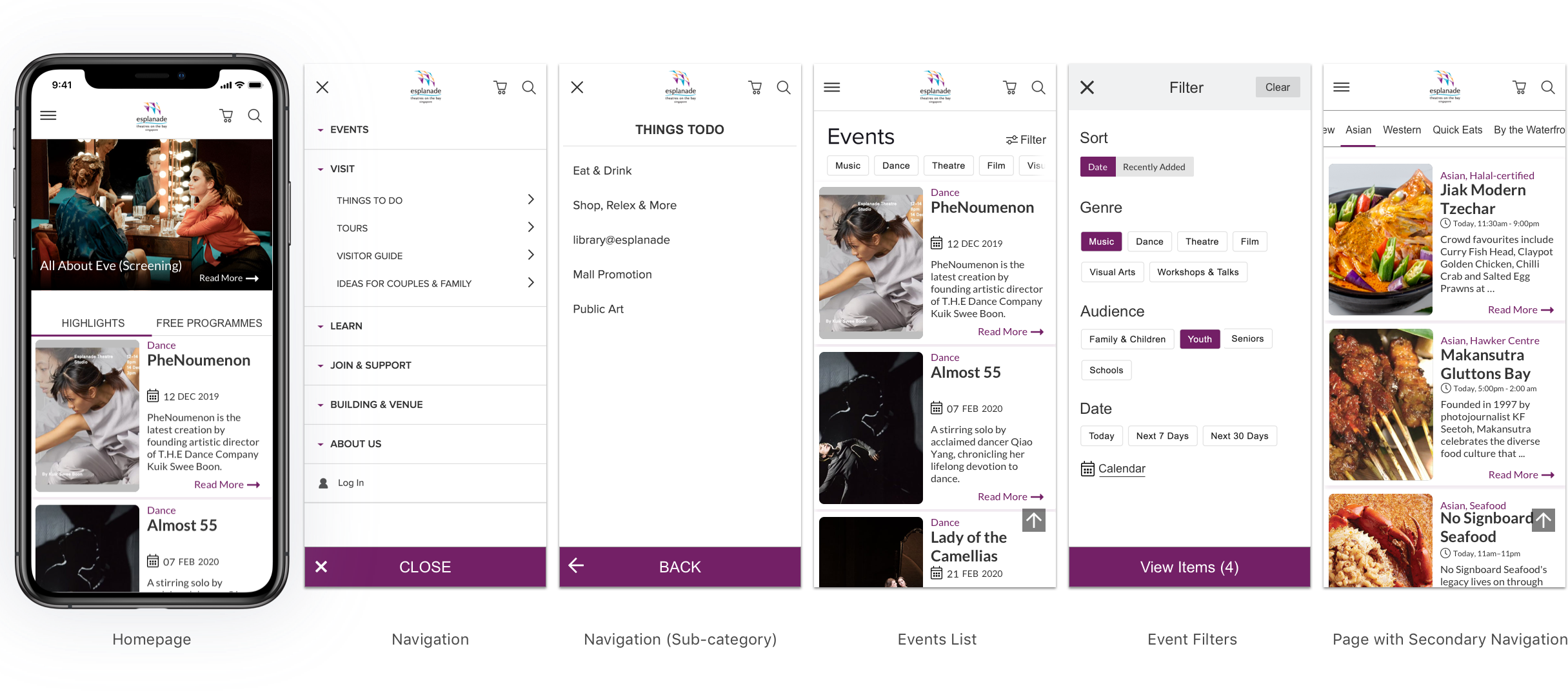
Homepage & Navigation

We added an easy reach button to the bottom of the navigation.

Quick filters & Back-to-top button

For the events list page, a set of most-used filters is added to the top to allow users to filter the events quickly. Additionally, a back-to-top button was added to allow users to browse the content easily.

Scrollable tabs

For pages with secondary navigation, we introduced scrollable tabs. Users can quickly swipe left and right to switch between tabs.

What's Next

There are a couple of areas that can be improved. Schools are one of the target customer segments of Esplanade. Due to the time and resource constraints, we couldn't conduct any research on this customer segment, and thus the school-related features are out of the scope for this project.

We would also like to present our solution to Esplanade's stakeholders and get their thoughts and feedback on real-world problem situations that we can solve. Creating products that solve real problems with a purpose will generate a sense of achievement for me.